
Visual generative models can create convincing natural textures, environmental lighting, and complex scenes. When prompted for a mountain landscape, a studio still life, or an editorial fashion image, current systems often produce results that look polished at first glance. Yet the moment a workflow requires branded packaging, retail labels, or precise typography, that realism can give way to obvious visual errors.
For packaging designers, production artists, and brand managers, commercial containers are governed by exact geometry, strict hierarchy, and regulatory requirements. The UK’s official product labelling rules, for example, require included information to be accurate and labels not to mislead consumers about a product’s quantity, materials, origin, or capabilities. Consumer packaging also relies on controlled spacing, repeatable colours, and letterforms that must remain readable at small sizes. Generative image systems, however, usually build pixels rather than editable vector curves or production-ready type. Understanding that difference is essential for any team using generated imagery in a design pipeline.
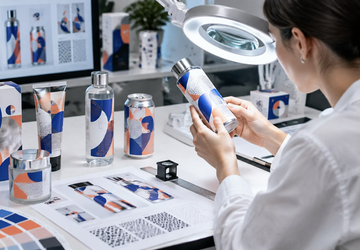
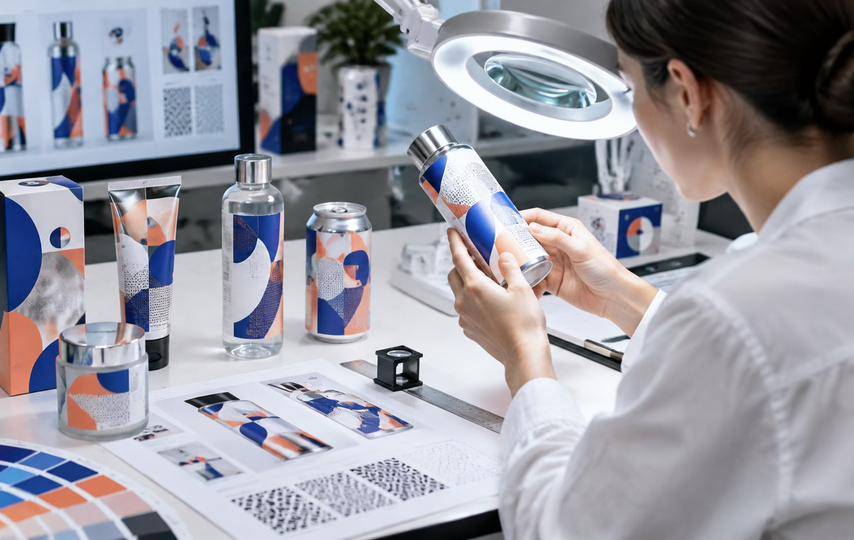
Generated packaging needs close review for type, geometry, colour, and material behaviour.
Why Typography Is Unusually Difficult
Text is discrete and intolerant of small changes. A reader recognises letters through consistent structural rules. Move a crossbar, close a counter, or distort the spacing between two characters and a familiar word quickly becomes difficult to read. Natural textures behave differently: a small variation in stone, skin, fabric, or cloud detail may still look plausible.
Image models are generally better at continuous visual patterns than at maintaining every character in a long line of exact copy. Large display words sometimes survive because they occupy enough pixels to preserve a recognisable shape. Ingredient lists, warnings, flavour names, and volume declarations are more vulnerable. At a distance, the output may resemble printed language, with rows and rhythms that look like text. Closer inspection reveals missing strokes, invented glyphs, duplicated letters, or words that change halfway across the label.
Repeated symbols add another layer of difficulty. A grid of identical certification marks or a brand name repeated on several packages should be visually consistent. Generated imagery may vary the shape from one instance to the next because each appearance is reconstructed within a different local context. A design that feels coherent from across the room can therefore fail immediately when a customer zooms in.
Packaging Adds Curvature and Perspective
Retail products rarely present their artwork on a perfectly flat plane. Bottles, jars, flexible pouches, cans, and tapered boxes bend graphics around surfaces with different curves. In a conventional design workflow, artwork is placed through controlled projections, mock-up templates, or three-dimensional mapping so that lines and logos follow the package correctly.
In creative workflows using nano banana pro, a generated package can provide a compelling concept, but the label still needs close inspection. The model may treat a curved surface as if it were nearly flat, causing text to ignore the bottle’s contour or a badge to stretch unevenly around an edge. Vanishing points can also disagree: the package may suggest one perspective while the printed panel follows another.
These errors become more visible on familiar objects. Viewers know how a can, carton, pump bottle, or tube should be constructed, even if they cannot describe its geometry. A cap that is slightly off-centre, a label that bends in the wrong direction, or a box flap that meets at an impossible angle can make the whole image feel artificial.
Reflections Can Damage Brand Details
Material finishes complicate the problem further. Packaging often combines glossy varnish, matte paper, foil, transparent plastic, glass, or embossed details. In photography, controlled lighting and polarisation help keep labels readable while preserving the character of the material. In generated imagery, highlights may cut through lettering, merge characters, or change the perceived colour of a logo.
Brand colours are especially sensitive because they are usually approved as controlled values, not approximate moods. A generative image is influenced by the entire scene: warm window light, a coloured background, or a bright reflection can shift the apparent hue of the package. That may be acceptable for an exploratory mood board, but it is not enough for a final asset that must match a verified colour specification.
The sensible approach is to separate atmosphere from identity. A model can help establish lighting, materials, setting, and composition. Exact logos, mandatory copy, barcodes, and controlled colour fields should remain subject to conventional design checks and, when necessary, conventional compositing.
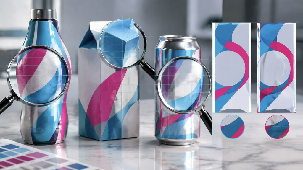
Magnified inspection can reveal distortions that disappear at normal viewing size.
A Structured Review Sequence
Generated packaging should not move directly from an appealing preview into an advertisement or product page. A repeatable quality-control sequence catches faults more reliably than a casual visual scan.
Start by comparing every visible word with the approved copy. Check spelling, punctuation, duplicated characters, and the spacing within the brand name. Next, inspect logo proportions and negative space. A logo can contain the correct general silhouette while still being wrong in ways that matter legally and commercially.
Then review the container itself. Follow each vertical edge, seam, cap, handle, and fold. Confirm that the label follows the same perspective and curvature as the package. After geometry, examine highlights and shadows. Reflections should describe the material without erasing important information or cutting the object into contradictory planes.
Finally, view the image at its intended delivery size. A label that appears acceptable on a large monitor may collapse when reduced to a marketplace thumbnail. Conversely, tiny invented copy that is obvious at 200 percent magnification may not matter if the final image never presents it as readable information. The review standard should match the real use of the asset while remaining strict about anything customers are expected to understand.
Choosing Regeneration Local Editing or Compositing
When a review reveals errors, the next decision is whether to regenerate the whole image, edit a local area, or finish the asset in conventional design software. Regeneration is useful when the overall composition, product shape, camera angle, or lighting direction is fundamentally wrong. It is less efficient when the scene is strong and only a logo or line of text has failed.
Local editing can help remove isolated artifacts, repair a background edge, or simplify an area before typography is added. Systems such as GPT Image 2.5 give teams another route for generating and revising visual material, but the edited area still requires the same inspection as the original. Repeating an edit does not automatically produce accurate kerning, verified legal copy, or an exact registered mark.
For production work, conventional compositing remains the dependable option for elements that must be exact. A designer can generate a clean container, lighting concept, or background and then apply approved vector logos and typography with perspective tools or displacement maps. This hybrid method uses generation where variation is valuable and deterministic software where precision is non-negotiable.
Quality Control Is Part of the Creative Process
Packaging errors are not evidence that generative imagery has no place in commercial design. They show where its strengths end and where established production skills still matter. Models are useful for exploring materials, environments, compositions, and visual directions quickly. They are less reliable when a task demands exact spelling, repeated symbols, controlled geometry, and regulated information.
Teams that recognise this boundary can use generated imagery without lowering their standards. The goal is not to keep regenerating until an image happens to look correct. It is to choose the right method for each layer of the asset, inspect the output systematically, and preserve human control over every detail that represents the brand.