
A few years ago, I thought visual localization was mostly a translation job. If the text on an advertisement had been translated correctly and the product remained easy to recognize, the campaign seemed ready to publish.
I no longer see it that way.
Whenever I compare campaigns made for different countries, I pay less attention to the translated headline and more attention to the life shown around the product. Who is using it? Where are they? Does the room look believable? Would someone in that market actually use the product in this way?
Those details often reveal whether a campaign was genuinely adapted or simply translated.
I Start With the Life Around the Product
People rarely encounter a product in isolation. They see it in a kitchen, on a commute, at work, in a shop, or in someone else’s home. That surrounding context quietly tells them who the product is for.
This is where a global campaign can begin to feel distant.
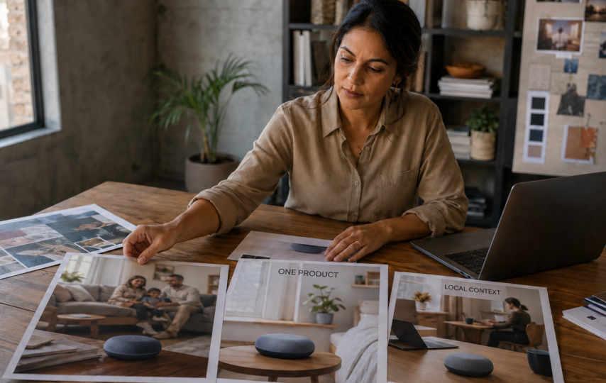
Suppose I am preparing an advertisement for a smart home device. The original visual shows the product in a spacious open-plan house. It may look polished, but that setting will not feel equally familiar everywhere. In a city where compact apartments are common, the room could make the product look expensive, impractical, or designed for someone else.
I do not need to add a national flag or a famous landmark to fix that. I may only need to rethink the room, the furniture, the people, and the way the device is being used.
To me, that is visual localization: adjusting the ordinary details around a product until the scene makes sense to the intended audience.
I Decide What Cannot Change Before Creating Anything
Localizing a campaign does not give me permission to redesign the product.
I have seen concept images in which packaging changes color, controls move to a different position, or the product suddenly gains features it does not have. The image may look attractive, but it is no longer useful marketing material. It risks showing customers something they cannot actually buy.
Before exploring any variation, I write down the elements that must stay fixed:
- the product’s shape and proportions;
- its real materials and colors;
- packaging and logo placement;
- the feature being promoted;
- the broader identity of the brand.
Once those boundaries are clear, I can work more freely with the setting. The room, casting, clothing, weather, time of day, and activity may all change, provided that the product remains accurate.
This small step saves me from reviewing a collection of beautiful images that have drifted away from the original brief.
I Use AI to Explore, Not to Approve
What I like about AI image generation is the speed at which I can examine an idea from several angles.
If I am unsure whether a product belongs in a family setting, a home office, or a small retail space, I can develop rough versions of all three. Seeing them side by side usually tells me more than discussing them in abstract terms.
For this kind of early exploration, I can use Flux 3 to turn a written campaign idea into several visual directions before deciding which one deserves further development.
I still treat those results as drafts. They help me ask better questions:
- Is the product immediately noticeable?
- Does anyone in the scene appear to need it?
- Is its use easy to understand?
- Does the setting feel ordinary or artificially staged?
- Have any details of the real product changed?
I would not send the first generated image directly into a paid campaign. My aim at this point is to find a promising direction, not a finished advertisement.
I Change One Part of the Scene at a Time
One mistake I try to avoid is changing everything in a single attempt.
If I replace the people, setting, camera angle, lighting, product position, and color palette at the same time, I cannot tell why the new version works—or why it fails.
Instead, I keep the product and composition stable while testing the environment. Once the environment feels right, I may compare casting or clothing. Lighting and finishing come later.
Here is the simple review structure I use:
| What I review | What I want to know |
| Product | Does it still match the real item? |
| Setting | Could the intended customer realistically be here? |
| People | Do they fit the situation without looking staged? |
| Action | Is the product being used naturally? |
| Brand | Does the image still belong to the same campaign? |
The table is not a strict formula. It simply stops me from being distracted by image quality while missing a basic contextual problem.
I Avoid Obvious Cultural Shortcuts
When people hear “localization,” they sometimes reach for the most visible cultural symbols: landmarks, flags, traditional clothing, or familiar foods.
I am cautious about this approach. A campaign can become less convincing when it tries too hard to prove where it belongs.
Most customers spend their days in ordinary places. They work at desks, shop in local stores, sit in traffic, prepare meals, and spend time at home. Showing these familiar situations often makes a product feel more relevant than placing it beside a recognizable monument.
There are cases where traditional clothing or a festival setting is entirely appropriate. I would use them when the campaign genuinely relates to that occasion—not as decoration added to make a generic visual appear local.
The question I keep returning to is simple: does this detail belong in the scene, or was it added because an outsider expected to see it?
I Ask Someone Local to Challenge the Image
I do not assume that I can accurately judge every market from research alone.
An image may look natural to me while feeling outdated, exaggerated, or socially misplaced to someone who lives there. A room can imply the wrong income level. Clothing may belong to a different age group. A supposedly familiar activity may not be common at all.
That is why I want feedback from someone who understands the audience before I approve a direction.
I do not ask whether the image is “good.” That question usually produces vague answers. I ask more specific questions:
- Would this situation happen in everyday life?
- Does anything feel imported from another market?
- Is the product being used normally?
- Does the scene rely on a stereotype?
- Who would feel excluded from this image?
- What would you change first?
The answers are often uncomfortable, which is useful. It is much cheaper to discover a weak assumption during concept development than after the campaign has launched.
I Check the Product Again Before Looking at Performance
AI-generated concepts can distort small details. Labels become unreadable. Buttons move. Packaging changes. Hands interact with products in impossible ways.
These errors are easy to overlook when the overall picture is attractive.
Before testing an image, I compare it with the real product. If an important detail is wrong, I correct it manually or develop another version. I also avoid using an AI image to imply a feature or result that the product cannot deliver.
Only after that review do I look at campaign performance.
I may compare click-through rates, landing-page behavior, conversions, or comments across several visual versions. Still, I do not assume the most localized image will automatically win. Sometimes the simpler concept performs better because the product is easier to understand. Sometimes a familiar setting helps. On another campaign, the setting may become a distraction.
The audience response matters more than my attachment to a particular design.
What I Have Changed in My Own Approach
I used to think consistency meant keeping nearly everything the same across markets. Now I separate brand consistency from contextual sameness.
The product should stay recognizable. The promise should remain honest. The brand should still feel like itself. But the life shown around the product does not have to be identical everywhere.
I now treat AI as a sketchbook for this process. It lets me explore ideas, notice weak assumptions, and compare settings before committing to production. It does not understand a market on my behalf, and it does not make the final decision for me.
That distinction matters. The technology can produce options quickly; relevance still comes from research, local judgment, and careful review.
Final Thoughts
When I localize a marketing visual, I am not trying to make it look obviously “foreign” or obviously “local.” I want the product to appear in a situation the intended customer can recognize without needing an explanation.
That usually means preserving the product while questioning everything around it: the room, the people, the activity, and the small details that make a scene feel real.
AI has made the exploration stage faster for me. The hard part has not changed, though. I still have to decide whether the image understands the audience—or merely looks as if it does.