
Presentations are a good way of simplifying information. They come in useful in various spaces, such as in a class project, or in an organization’s sales pitch.
It is common knowledge that great stories make a killer presentation, but one thing that makes them even better is how these stories are visually depicted. It is very important to know how to optimize the effect of visuals and use them to elevate your presentations.
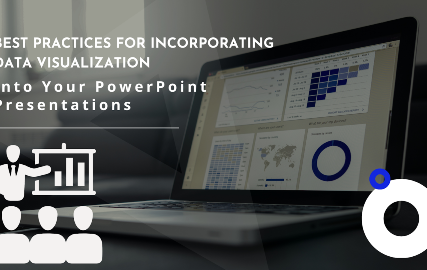
Knowing how to use visual aids will help you to create presentations that are both impactful and engaging for your audience. Let’s find out more about incorporating data visualization into your powerpoint presentation. But, first, we look at the Powerpoint presentation software.
PowerPoint Presentation Software
Different presentation software has been developed over time, and some of these are PowerPoint, Google Slides, Microsoft Sway and Visme. These software are designed to create presentations. They help make the process of designing presentations easier, and they have their various uses.
Some important features of presentation software include the fact that they allow for interactive scrolling and content flow.
The presentation software you use depends on your preferences, as they have different strengths. However, out of all these applications, analysis of the reliable ppt statistics suggests that people of all ages have PowerPoint as their presentation software of choice. This might be due to various reasons such as:
- The fact that it is a collaborative solution. It allows multiple people to work on a presentation at once, due to its online cloud storage.
- It contains existing templates, and users can also create their own designs.
- It can be used for some other things apart from designing presentations. Some of its other functions include the creation of infographics, fliers and videos.
What is Data Visualization?
Just as the name suggests, data visualization is the practice of presenting data in a graphical or visual format. It is the use of tables, charts, graphs, timelines, maps and other visual aids to help people understand information.
According to a study led by Piotr Winkielman , a professor of psychology in the University of California, San Diego, pictures move people more than words. Humans are visual creatures, and most people learn better from images and pictures that back up the information they have seen.
Data alone doesn’t make a good presentation. Instead, how it is presented also matters most. It is important to know how to use visual aids to create visually appealing presentations that are also impactful.
Types Of Data Visualization
a
There are various types of data visualization that can be used to make a presentation visually appealing and engaging. Some of them are:
Charts
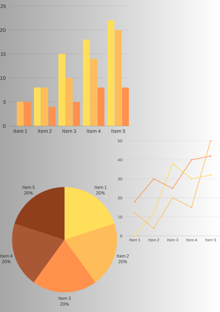
Bar charts, Pie Charts and Line Charts are all examples of charts that are appropriate for different situations. For example, bar charts can be used to compare different data sets, such as the types of presentation software preferred by people of different ages.
A line chart on the other hand can be used to show fluctuations in data, like sales performance over the period of one year. A pie chart can show the percentage of clients that like different products.
Different types of charts can be beneficial if used strategically.
Tables
A table is an age-old method of data visualization. This does not however mean that it is no longer relevant in today’s world.
The ability to create colorful and creative tables that represent your data in an engaging way is an important skill to learn. Data can be represented in rows and columns, while colors are used to highlight different values, based on a specific color scheme. For example, you can use the color green to represent positive values and red to show negative ones.
Maps
Maps are a useful way to show the geographical reach of a product. Using a map can help to create a more professional PowerPoint design that wows your audience.
For example, in a sales review, a world map with highlighted areas depicting sales performance can be presented. You can use different colors to clarify your point further, with the darker shades representing places where the product is popular, and lighter shades showing places where it performs less.
Timelines
Timelines are a good way to present chronological data. This could be used to:
- Show the history of a product
- Make future predictions about its performance.
Using timelines as a visual aid gives the impression of professionalism and efficiency. This can help your clients build trust in you and your work.
3 Reasons Why You Should Incorporate Data Visualization Into Your Presentation.
Studies suggest that pictures move people more than words that imply the same thing. Humans are constantly looking for images and videos to help them understand information better.
Here are some other reasons why you should consider adding visual aids to your presentation:
- It leaves more impact on your audience: using visual aids help with memory retention. It is easier to remember the images than it is to remember words, and this is an advantage for both the presenter and recipients.
- It makes it easier to recognize patterns: Growth patterns and the relationship between different data sets can be seen more easily with the aid of a visual representation.
- It is engaging: visualization helps to create interactive PowerPoint presentations, and this keeps your audience engaged. It makes for a better overall experience for all involved.
Best Practices For Incorporating Data Visualization Into Your PowerPoint Presentation
When incorporating visual aids into your presentation, here are some best practices you should keep in mind:
- Don’t Overdo It: It is easy to get carried away with creating charts and graphs to go along with your data. Using too many will achieve the opposite of what you are trying to do. It can make your data hard to understand. It is important to focus on the information you are trying to convey and to not place more than one form of visual data in one slide. Remove unnecessary elements like extra designs, as this will only take away from the overall appeal.
- Focus On the Design That Best Represents Your Brand: You can make your designs show the core elements of your brand. This can be done by using the brand colors to design your visuals. For example, if you are trying to represent your brand as youthful and progressive, you can use playful and bright colors to design visual aids
- Highlight the Very Important Parts Of Each Presentation: In every chart, graph or table, there is always the ‘aha’ zone. That is the main point of the data being shown. While it is smart to say it out, highlighting it in the slide is even better. You can do this by bolding the part, circling, or underlining it. This helps to appeal to the aural, visual and verbal senses of your audience.
- Label The Components Of Your Visuals Clearly: For every line and graphic, write the clear meaning under the image. Do not assume that your audience already understands what you are trying to say. Also, don’t think that because you showed the meaning of an abbreviation in a previous slide, they will remember it in the subsequent slides. Try to always make your presentations as clear as possible.
- Pick The Visual That Best Illustrates Your Story: Choosing the right visual is very crucial in determining whether your audience will understand your story or not. Try to understand the correct applications of the different types of visuals before using them. Selecting the right colors, alignment and font size go a long way in making your data more appealing.
Conclusion
At one point or the other, we have all had to present information to our colleagues at work, or in a class project. Raw data gets boring really fast. It is crucial to know how to present data in a way that is easy to understand, while keeping your audience engaged.
Visualization refers to presentation of data in image form. It goes a long way in making data more accessible and clear. Knowing how to incorporate visuals into your PowerPoint presentation in a way that adds value to your story is an important skill to learn.
Some of the best practices include using minimal designs to avoid overcrowding, choosing colors that represent your brand values, and labeling your slides so that your audience understands your point.