
Though they are sometimes blended together and occupy similar spaces, UI and UX often clash when designing apps and web pages.
A user interface is more about how humans interact with software within the framework provided, so it’s the buttons and tooltips that guide them. The user experience is much broader, including more creative, subjective, and brand-oriented considerations. This means that user experience needs to accommodate a user interface that is informative and makes logical sense, sometimes at the expense of more creative designs.
UI And UX Balanced Right
It’s easy to point out when some Silicon Valley start-up opts for a minimalist design philosophy over flowery designs. Instead, the best examples of where UI and UX can clash or work in harmony are colorful brands that must deal with a lot more ‘noise’ on the page.
First, an example that does it right, leveraging understandable UI with a broader, colorful UX – the live casino. Many iGaming sites use simple neutral colors as their backdrop, or green to invoke the soft surface of a cards table. The so-called noise comes with the games, all using different colors and themes. However, they are contained in their own boxes, which are clickable buttons, while other buttons like search filters are kept minimalist and strictly business. Those boxes are windows for window shoppers, showcasing the games available as the other buttons on-page exist to shuffle them and find whatever floats their boat.
How UX Overgrows UI
Now that we know what doing it right can look like, let’s consider how and why UX can interfere with the UI of an app or webpage. When a business is based from or deals in creative work, the app or page associated may be thought of as its own art piece. That’s why overzealous UX designers may want to flood the whole page with gauche colors, distracting backgrounds, or unnecessary animation.
In that sense, bad UX can be like a plant that overgrows and overstays its welcome. If a person, typically a creative type, has a very specific and profound feeling they want to illicit in the user, they’ll stop at nothing to get there. They may be bought into a trend or reject feedback, both critical UX errors.
Being so close to the product, they may be able to intuit the UI and assume others can too, even though the users won’t have their experience. It’s the same principle as authors being “too close” to their work, unable to edit it in an unbiased and productive way. That’s where the UI becomes pared down and diluted through UX changes that are fanciful and ultimately unnecessary – pure form over function.
How UI Undercuts UX
It may sound like UX is the yin to UI’s yang, but UI can also go too far. Nobody wants to use an app or a webpage that looks like a 90s website at best, an Excel spreadsheet at worst. If you’ve ever had a site load incorrectly, displaying just the HTML rundown of a page’s contents, then you know that a dry user interface kills interest fast.
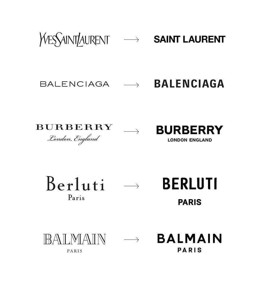
Detailed best in the thread above, ever-simplifying logos are a great, sometimes ridiculed example of minimalism run rampant. Big companies stake it all on simplicity and memorability, which works for big companies that have established brands, but smaller ones mired in creative branding shouldn’t follow suit. A UI that is too dry risks boring the user or overloading them with information that would be better delivered through interesting, eye-catching graphics created by somebody with a good eye for UX. Their apps and webpages benefit from having some life to them, some flair that stands out from the crowd on the app store instead.