
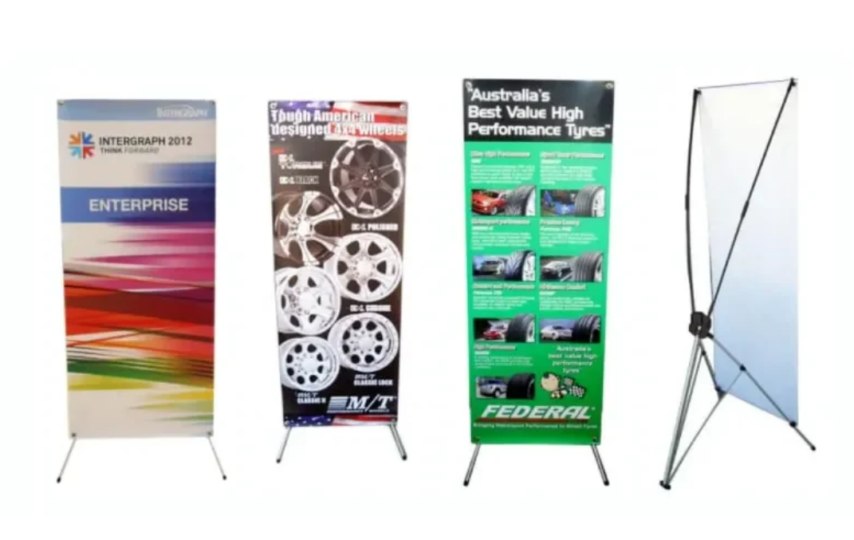

Walk into any local expo, shopping centre event, school fundraiser, or business conference and you’ll probably see at least a few of them.
Near entrances. Beside tables. Slightly tilted in corners because somebody rushed setup fifteen minutes before opening.
The humble x banner.
And honestly, most people barely notice half of them.
That sounds harsh maybe, but it’s true.
Some banners blend completely into the background even in quiet spaces. Others somehow pull your eyes immediately, even when you weren’t planning to stop walking.
Interesting difference considering they’re basically the same product.
So what changes?
Usually not the price.
Most People Look at Banners for About Two Seconds
Maybe less.
That’s the first thing businesses underestimate when designing an x banner. People are moving. Carrying coffee. Looking at phones. Searching for bathrooms at events. Trying to find registration desks.
Nobody stands there patiently reading paragraphs.
Attention works differently in public spaces.
Fast. Distracted. Fragmented.
Which means complicated banners lose immediately.
Too Much Information Makes People Skip Everything
You’ve probably seen this before.
A crowded x banner full of text blocks, multiple fonts, phone numbers, social handles, long explanations, maybe even five different colours competing for attention.
And the weird thing is, when there’s too much information, people often absorb nothing at all.
Their brain checks out instantly.
Simple banners usually survive longer because they reduce effort. One message. One direction. One thing to remember.
That’s it.
The Best X Banner Designs Usually Feel Slightly Empty
This surprises people.
Businesses often think they need to fill every inch of available space. But strong x banner layouts usually leave breathing room intentionally.
Large text. Clean spacing. One clear image maybe.
Empty space helps eyes settle faster.
Especially in busy environments where visual noise already exists everywhere. Event halls. Retail stores. Conferences. Crowded community fairs.
A cluttered banner inside a cluttered room disappears fast.
Placement Changes Everything
Even a good x banner can fail completely if it’s positioned badly.
Blocked by tables. Hidden behind crowds. Facing the wrong direction. Too close to other signage fighting for attention.
You notice this constantly at trade shows.
Some businesses spend ages perfecting banner design, then place it somewhere nobody naturally looks while walking.
Human movement patterns matter more than people expect.
Corners work differently from entrances. Waiting areas behave differently from walkways.
Tiny adjustments change visibility massively.
People Usually Notice Images Before Words
This happens almost automatically.
Your brain processes visuals faster than text, especially while moving.
A strong image on an x banner often determines whether somebody slows down enough to read anything else at all.
But not every image works.
Overly polished stock photos sometimes feel forgettable because people have seen similar visuals hundreds of times already. Real products. Real spaces. Genuine faces often hold attention longer.
Even if technically less perfect.
Actually, sometimes especially because they’re less perfect.
Event Spaces Create Strange Attention Patterns
There’s this weird thing that happens at crowded events.
People stop paying attention after seeing too many banners in a row.
Everything blends together eventually.
That’s why an effective x banner usually relies on clarity more than complexity. Something instantly understandable from a distance while people are mentally overloaded already.
Because by the tenth banner, attention drops sharply.
Humans get visually tired surprisingly quickly.
Colour Helps… Until It Starts Fighting Too Hard
Bright colours definitely attract attention.
But only briefly if the design feels chaotic.
Some x banner displays rely so heavily on loud colours that readability disappears completely. Neon backgrounds. Clashing fonts. Too many highlighted sections demanding equal attention.
And suddenly nothing stands out anymore.
Good contrast matters more than brightness alone.
Readable wins.
Almost every time.
The Slightly Crooked Banner Problem
This sounds minor but people absolutely notice it.
A bent frame. Sagging material. Uneven setup.
A poorly installed x banner changes how people perceive the business attached to it, even subconsciously.
Humans make strange judgments from visual details.
Straight banner equals organised business. Crooked banner equals rushed or careless. Fair or unfair, those associations happen automatically.
Especially in professional settings.
Smaller Businesses Often Use These Better
Funny enough, local businesses sometimes create stronger x banner displays than larger companies.
Probably because smaller businesses usually focus on one message very clearly.
A café promoting one special offer. A fitness trainer advertising one service. A local bakery announcing weekend catering.
Simple sells better in physical signage.
Big brands occasionally overcomplicate things because too many departments want input at once.
And the banner ends up trying to communicate everything simultaneously.
Portable Signage Still Matters More Than People Think
Digital marketing dominates conversations now.
But physical visibility still works differently.
An x banner exists in real space. Near actual people. At events, entrances, conferences, retail stores. Places where attention behaves differently compared to online scrolling.
Physical signs interrupt movement patterns naturally.
You can ignore online ads instantly with a thumb swipe. Physical signage sits directly inside your environment.
That still matters.
Fast Setup Is Part of the Appeal
People underestimate how practical these banners are.
A lightweight x banner can be carried easily, assembled quickly, moved around between events, reused repeatedly.
That flexibility makes them popular for businesses juggling changing schedules constantly.
One weekend it’s a local market. Next week a networking event. Then a shopping centre activation.
Portable signage survives because businesses need adaptable tools.
The Most Effective Banners Usually Say One Thing Well
Not ten things adequately.
That’s probably the biggest difference between banners people remember and banners they instantly forget.
Strong x banner messaging feels focused. Direct. Slightly confident even.
One clear headline.
One clear offer.
One clear action.
Anything beyond that starts diluting attention fast.
Human Attention Is Weirdly Emotional
People don’t always stop because a banner is technically “good.”
Sometimes timing matters more.
Someone notices your x banner while already thinking about coffee, fitness, printing services, or home renovations because that topic already existed in their mind beforehand.
The banner simply intersects with the right moment.
That’s why repeated exposure matters too.
Familiarity builds quietly over time.
Real-World Wear Changes Perception Quickly
After enough events, some banners start looking tired.
Scratches. Wrinkles. Slight fading. Bent support poles.
And honestly, worn-out x banner displays can affect credibility more than businesses realise. People connect presentation quality with business quality automatically.
Not logically.
Just instinctively.
Sometimes Simplicity Feels More Trustworthy
This is interesting psychologically.
Minimal banners often feel more professional because they don’t seem desperate for attention.
A calm, readable x banner usually communicates confidence better than one overloaded with promotional language and giant exclamation marks everywhere.
Quiet clarity feels intentional.
And intentional design tends to earn more trust.
Most People Won’t Remember Exact Details
That’s important too.
They might not remember your phone number immediately. Or exact wording.
But they remember seeing the banner.
Maybe repeatedly.
And later, when they actually need that service, familiarity returns first.
That’s where a consistent x banner strategy quietly works over time, even when individual interactions feel brief or forgettable in the moment.
In the End, Attention Usually Comes From Clarity
Not complexity.
Not giant graphics screaming for attention.
Just simple communication placed where real people naturally pause, walk, wait, or look around during ordinary movement.
That’s when a good x banner works best.
Quietly.
Without forcing it too hard.