
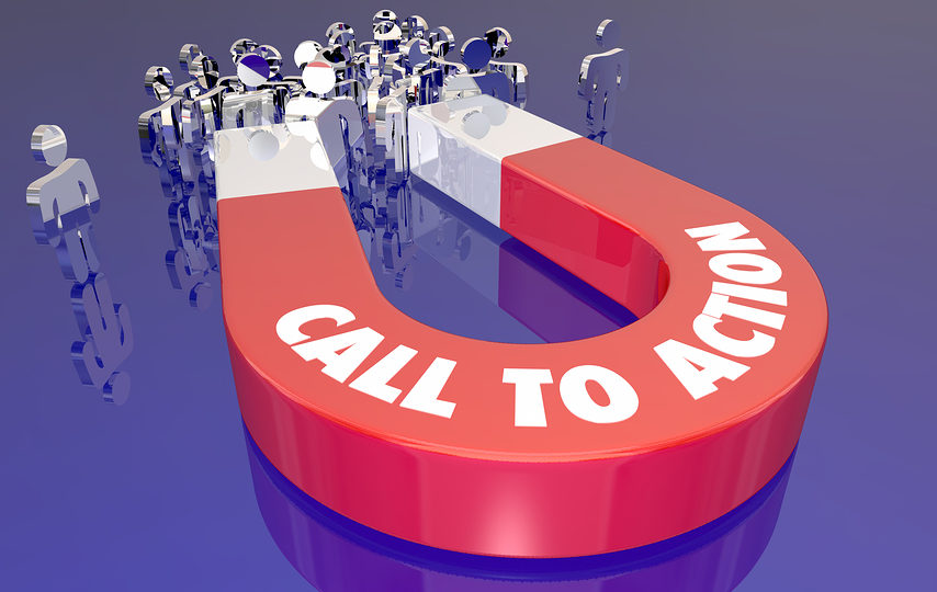
A call-to-action or CTA is a key ingredient to make your marketing efforts successful. What is a CTA, you ask? We come across them on almost every website we visit. Imagine if you were visiting an internet services retailer’s website. You click on the “Order Now” button and it connects you to Spectrum Triple Play. The order now button is a CTA and by clicking on it, you convert into a prospect or a customer. CTAs are designed for success, without which, your digital marketing campaign is at a disadvantage.
What’s a CTA and Why is it Important?
A CTA is an appeal to your website visitors for a response. It’s usually a clickable button with your website copy. Responding to a CTA is a conversion. It can be downloading a pdf, ebook, filling out a form or clicking through to another page. A successful CTA results in a conversion. A good CTA can mean the difference between a bounce or a conversion. CTA in digital marketing have the following 3 important features:
- Placement
- Design
- Copy
Let’s dive right into them.
Placement
CTA placement is the first step toward creating successful calls-to-action. There are 3 basic rules to follow in CTA placement.
First, you should have multiple CTAs. There is no written rule that says you can only have one CTA on one page. CTA’s are chances to convert. The more of them on a single page, the more chances for a user to convert. Place them at different points on the page, but make sure they aren’t competing with each other. Too many options will only end up confusing the user. Choice paralysis (or making no choice at all) can occur with too many competing CTA’s. Use them liberally but with a clear purpose.
Second, you should have CTAs on every page. Each page on your website is an opportunity to convert to something different. Visitors could be buying a different product, downloading your ebook or even just filling out a form. Having a CTA on every page on your website is just more opportunities for visitors to convert to something.
Third, your CTAs should be prominent. They should be in strategic places on your web pages. They should get the most visual focus and attention from visitors. The best places to place your CTAs are:
- Side panels
- Headers
- End of page/blog/article
Keep testing the CTA placement on your website and tweak it as needed.
Design
So you’ve figured out where you want to place CTA’s on your web pages. The next step is to use your judgment and research the creation of the CTA. The grunt work is the designer’s domain, but the responsibility of what the final product looks like is on you. Keep the following things in mind when designing CTA’s:
- Your CTA’s should be recognizable. There should be some common wording that people are used to on other websites. “Buy”, “Log In”, “Get Prices” are all words that people are used to seeing. Your CTA should be recognizable as something users need to click on.
- Well-designed CTAs work best. CTA’s are a part of the page but set apart from the main text. Your designer should suggest ways of using colors, negative spaces and shadows to create the perfect CTA.
- Prominent, appealing CTA’s are key to conversion rates. There needs to be a contrast between the CTA and the rest of the page. The CTA is meant to be appealing enough to entice users to click on it.
There is no secret formula to CTA success. You need to exercise your judgment and expertise to design a CTA that is recognizable, well-designed, prominent and appealing.
Copy
Now comes the most important feature of a CTA: the copy or wording. Well-worded CTAs boost conversions as compared to generic ones. A single word change on a CTA can boost conversion rates almost instantaneously. Changing words like “Order This” to “Get This” can make all the difference. Here are some points to focus on when writing the copy for your CTA:
- Use verbs. Word it strongly and make it motion-oriented. “Buy”, ”Learn”, “Get”, “Order” are all action words that encourage clicking on the button.
- Your CTA should clearly communicate the value it offers. It should make clear to visitors what value they get in return for converting. “Get a free ebook” or “Get a free quote” is much better than “Download” or “Submit” because they communicate value.
- Your copy should convey reassurance and trust. Words like “unsubscribe at any time” build trust between you and your customers.
- There should be clarity in the text. The user needs to know what will happen when they click on your CTA. So make sure the CTA does what it says it does. “Click to speak to an agent” should connect a visitor to AT&T customer service. “Click to get a free quote” should actually get the customer a free quote. If you want customers to convert, you need to clearly communicate why they need to click on the CTA. You can’t be ambiguous about it.